
- Choosing Social Explorer?
- Getting oriented
- Decisions and Selections
- Annotating
- Sharing and Animating
Before we begin
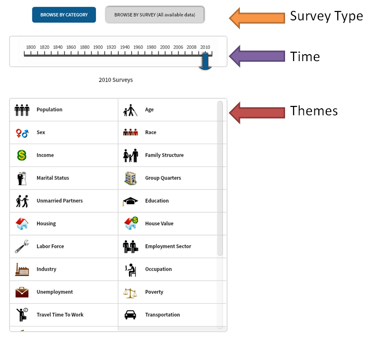
1. Is Social Explorer right for me?
Do use Social Explorer if you…
- Plan to use only U.S. census data
- Focus on the “story” of a map rather than a fully customized map
- Would like to use graphs from other data sources
- Want to share online maps
Do NOT use Social Explorer if you…
- Intend to use geographic data not a part of the U.S. census database
- Want to show data beyond:
- State
- County
- Census Tract
- Census Block Group
- Want to customize your own data symbolization
- Plan to integrate your maps with GoogleEarth or ArcGIS
Appetizer
2. Getting oriented
- First navigate to http://www.socialexplorer.com
- Click on “Take the Tour” button or “How To” tab
- Scroll to the bottom of the page and click on “Start Now”
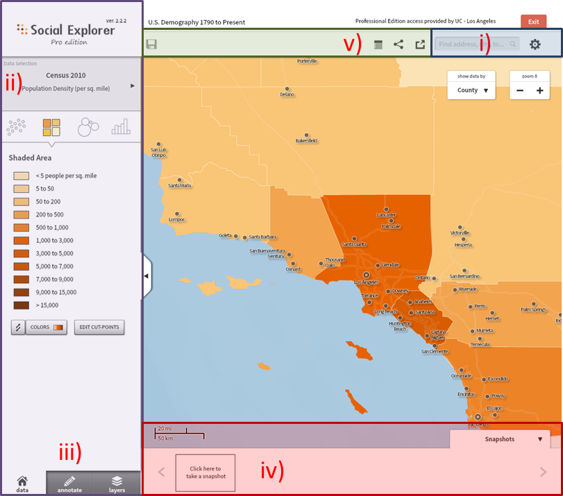
- The following interface will pop-up (without highlighted boxes):
Main Course
The colored sections are referred in the following way:
Section i) – Location Searcher
Section ii) – Subject Changer / Map Editor
Section iii) – Data/Annotation/Layer Toggler
Section iv) – Snapshot taker
Section v) – Exporting
3. Decisions and Selections
Setting your location of interest
Under the location searcher (section i) either enter the location of a U.S. location (address, city, county, etc.) OR leave empty if you intend to look at the whole country.
Selecting your subject
With the subject changer (section ii), choose the thematic subject you would like to show.
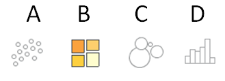
The buttons above show different types of data visualizations:
A) Dot density – Numeric data
B) Chromatic (colored map) – Categorized data
C) Graduated circles – Numeric/Categorized data
D) ??? (not map related?)
Be aware that not all selections are not available depending on the type of data.
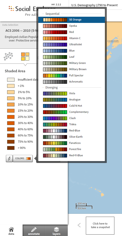
After choosing your subject of interest, you can now edit the map to portray your story. For themes that can be categorized, like “Total Population: Female” or “Worked at home” you can use a chlorochromatic map which has the following two custimization options:
Colorizing
The “Colors” button and Edit Cutoff points are both useful tools to showcase the data in ways that are more relevant for you.
Tips:
- Use a sequential scheme when you want to stress changes in your data relative to each other.
- Use a diverging scheme when wanting to show a change beyond a certain threshold
There are only 22 color schemes available, shown below:
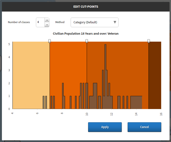
Setting breakpoints
Breakpoints are the “cutoff” points for grouped data which affects:
- How many colors there are
- What the audience is supposed to understand from your map (i.e. “This place has a higher work from home population”)
The following methods are available:
Natural breaks – Emphasizes distinct “natural” drop offs in the data
Quantile – Puts the same number of data points in each group
Equal Interval – Separate the data range equally
Custom – Allows you to manually set your breakpoints
Tip: Try to use between 4 to 6 classes, as that number of colors are easily readable on a map without being distracting.
4. Annotating
After clicking on the annotation tab (section iii) you will access the set of options for adding your information to the map.
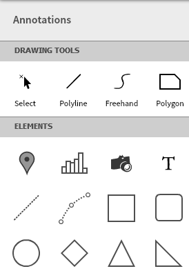
Drawing
- These tools are undefined shapes that you can draw onto the map to highlight a specific area.
- You can add these by drawing them onto the map.
Elements
- These are predefined shapes, which allows you to add objects such as markers, charts, photos, and text.
- You can add these by dragging them onto the map OR clicking on them.
Properties
Clicking an annotation object makes the following show up:
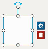
- The blue gear icon edits the annotation properties.
- While the trash bin will delete the annotation object.
- The white dots allow us to manipulate the annotation
- The blue arrow allows us to rotate
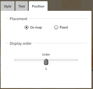
Within the annotation properties you can do things like change the fill of the annotation or make it so the object changes with zoom (on map) or will keep the same size as you zoom in and out (fixed).
Dessert
5. Sharing and Animating
After you have added appropriate annotations and designed a map to your liking, you can now take a snapshot of it by clicking the button within the snapshot tab (section iv).
These snapshots allow you to share a series of maps with others.
If you are satisfied with a static image, then you can simply export your map in the various ways shown in the export/share area (section v).
However, if you would like to make an animated map, the following steps show you how.
Making an animated movie of your map:
- Keep the zoom and area the same
- Take snapshots at different time periods but using the same data
- Or use different data during the same period
After you finish taking the snapshots, then choose “Export to Powerpoint” option, and then download the resulting file.
Open the file in powerpoint and then save as .wmv file.
Now you have a video of your map!
Demos
Shared Map Demo:
http://www.socialexplorer.com/89aacd3a4f1e4e1/view
Powerpoint demo:
http://www.socialexplorer.com/89AACD3A4F1E4E1/explore
Video Demo:
https://docs.google.com/file/d/0Bw70UyvGZsQFeU5wRTdWaUR2cHM/edit?usp=sharing