When displaying a georeferenced raster image in ArcMap that has a lot of line art, the lines are diminished to dashed lines due to the on-the-fly compression algorithms that are built in to the application.
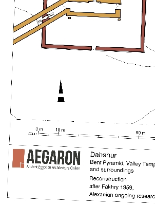
Case in point: Here is the original close up view of the georeferenced TIF image in photoshop:

As you can see, the tif image has been georeferenced with just 2 control points, rotated slightly, and scaled appropriately. A close up look (still in photoshop) reveals the line quality maintained:

However, when the geotiff is then imported into ArcMap, the lines become dotted lines! This is regardless of what compression is set. Here are 3 resampled examples published to ArcGIS Server (click to interact):

RGB Cubic

RGB Majority

RGB Nearest Neighbor
All 3 samples above were published as Image Services, changing the parameters to see if they made any differences. For all of them
I will be asking ESRI if they have a solution to this problem. If anybody has any suggestions, please post a comment below.