Links:
Self learning: http://www.esri.com/training/main/training-catalog/course-recommendations
This Tutorial: http://sandbox.idre.ucla.edu/?p=531
Data Visualization: http://selection.datavisualization.ch/
Social Explorer: http://www.socialexplorer.com/
Outline:
Part I – Introduction to GIS
- Introduction to GIS and ESRI
- Geographical information in the U.S.
- Hello Map: Thematic Mapping and the basics
- Layers
- Attributes
- Symbolization
- Labeling
- Chorpleth
Part II – Statistics and GIS
- Measuring Geographic Distribution
- Mean Center
- Directional Distribution
- Measuring Geographic Distribution
- Mapping Clusters
- Mean Center
- Directional Distribution
Part III – Full Circle: Beyond the Arc(Map)
- Other Geoprocessing Tools
- Data sources, data preparation, and more
- Exporting maps
- Mapping Exercise
Part I: Introduction to GIS
The ESRI way of GIS
The first step in this tutorial is to understand that we are covering the basics of desktop GIS analysis using ESRI’s ArcGIS software suite. This is by no means an all encompassing “this is GIS” tutorial, but rather a view on how GIS is used to build maps from ESRI’s perspective, limited by the functionalities of the software provided.
Generally speaking, the ESRI ArcGIS suite consists of 3 parts:
- ArcCatalog
- ArcMap
- 3D GIS (ArcGlobe/ArcScene)
Let’s explore each of these applications in class, understanding what each does, and how they work collectively.
Geographical information in the U.S.A.
Demographic information in the USA is typically arranged in a hierarchical geography, starting from large to small. Starting from States, the information gets broken down into Counties or Metropolitan Statistical Areas (MSAs) which are smaller regions within States. Each of those are comprised of Census Places which are similar to cities in their size and composition. Finally, the neighborhoods of each city are broken down into a Census Block Group. The last and smallest geographic unit is the Census Tract, which is a subdivision of Census Block Groups.


Hello Map: Thematic Mapping and the basics
Now it’s finally time to actually map something! For this exercise, you are provided with a LA Health geodatabase. A geodatabase, in this instance, refers to a single file, that when opened in ArcGIS, can be used as a container to add multiple GIS datasets. A GIS dataset can be anything from a layer of points, lines or polygons, it could be a raster image (eg. Satellite imagery), or it could simply be tabular data (eg. csv, excel). In other words, a geodatabase is a zipped file that can contain one, or many layers of geographic data. Here is a look at our LA Health geodatabase:
CA_CHIS.gdb
|--CA_Boundary
   |--CA_County
      |--CA_Zipcodes
      |--CA_CensusTracts
         |--CA_Blockgroups
|--Tables
   |--CA_birthZip_2010
   |--DeathZip2009
Download the CA_Health.gdb, and put it in a project folder for this workshop. In class, you will learn how to inspect the geodatabase layers in ArcCatalog, and then use ArcMap to create some maps. Topics to cover will include:
Layers (feature class)

Layers are referred to as feature classes in ESRILand. Learn how to add multiple feature classes to your project. Now drag each layer and re-order them. If you are familiar with Photoshop or Illustrator, you will recognize the commonalities on the layering concept. What happens when layers are re-ordered? How does this dictate your strategy on building a single flattened map with multiple layers?
Attributes

Every layer (feature class) comes with attributes. This is the all-important “data” part of mapping. The data in the attribute tables dictates what can get mapped. Open the attribute table of each layer, and study how each row and column is tied to the mapped element. Questions we will answer include:
- What is the unique identifier for each row?
- What other attributes exist?
- What happens when you select a row on the attribute table?
- How do you sort elements?
- Can you build custom queries?
- Can you build graphs?
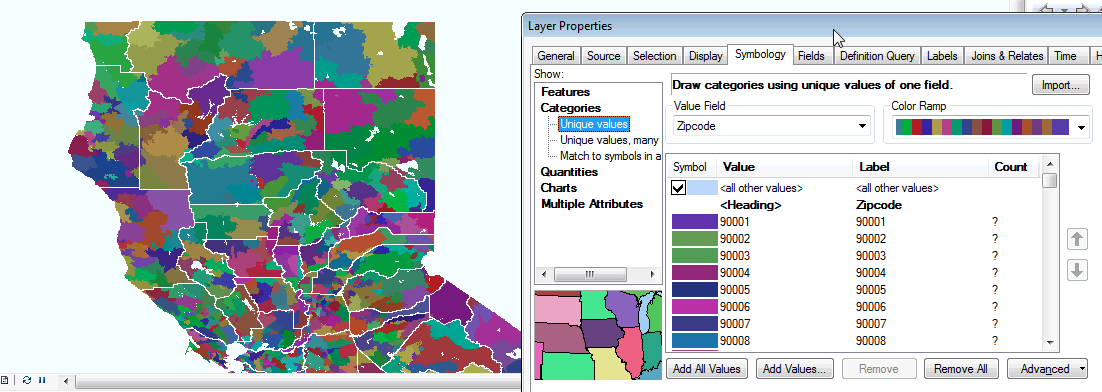
Symbolization

Outlines, fills, colors, weight, action! Here is the design phase of creating a map. Consider color choices: grayscale? color schemes? color hierarchy? Inevitably, you will find yourselves in the throes of ESRI’s symbolization quagmire… That said, experiment with two types of symbolization for the workshop data:
- Categories -> Unique values
- Quantities -> Graduated colors
Labeling

Map elements need labels at times. Consider what needs to be labeled, and what does not. Label sizes, fonts, weights, placement, colors are all things to inquire for your map. Understand the relationship between labels, attributes, and layers.
Choropleth Maps

For this exercise, you will learn how to do:
- Data manipulation in ArcMap
- Joining
- Spatial Join
To create a choropleth the following needs to be considered:
- Is the phenomenon you wish to map choropleth-able?
- Choropleths work best when representing data where boundaries are important
- Do you the data in the geographic scale you wish to map it at?
- Can you join the data to an existing layer?
- Which coloring style will best represent your data?
- If your information is continuous then use a single color gradiant
- If your information has a positive or negative range, use an opposite color scheme
Part II: Statistics and GIS
Measuring Geographic Distribution
- Mean Center
- Directional Distribution
 Mapping Clusters


Part III: Full Circle and beyond the Arc(Map)
Other Geoprocessing tools
- Buffer analysis
- Merging
- Kernel Density
Layout
Creating a layout in ArcMap, which should be an easy endeavor, can be one of the more frustrating experiences of using the Arc product. The layout features are very difficult to understand, and the user interface is at times non-intuitive. Even creating a text box that wraps a paragraph of text… is challenging… That said, things are doable… just not intuitive. We will go over the basic parts of creating a layout in class, but others may consider simply exporting the finished map into a more familiar environment like Illustrator or Photoshop… or even Powerpoint.
Things to explore:
- Data view vs Layout view
- Adding titles, text, legends
Data, data, and more data
Data Types
You can bring in tabular data in GIS from these formats:
- .xls
- .xlsx
- .csv
- .dbf
Data Sources
Data Cleaning
We want to get rid of any headers that are more than one line.
The resulting dataset will look like this:

Exporting maps
To export a map, you go to File –> Export.

Mapping Exercise
1. Spend 10 minutes on a mapping theme of your choosing and then head on over here or the form below and upload it!
2. Prepare a quick talk about the following:
Why you chose the type of map you did
How you made the map
What issues did you face?
Upload here:
[user-submitted-posts]